


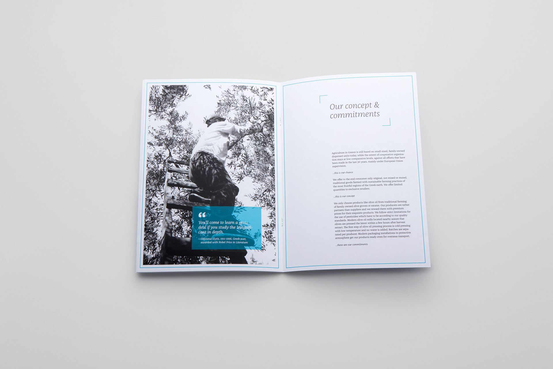
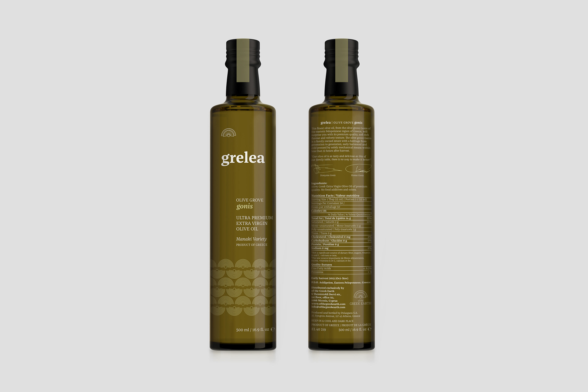
Brand identity and packaging design for a curated company offering limited quantities of Greek products from family-owned producers, each carrying the maker’s signature.


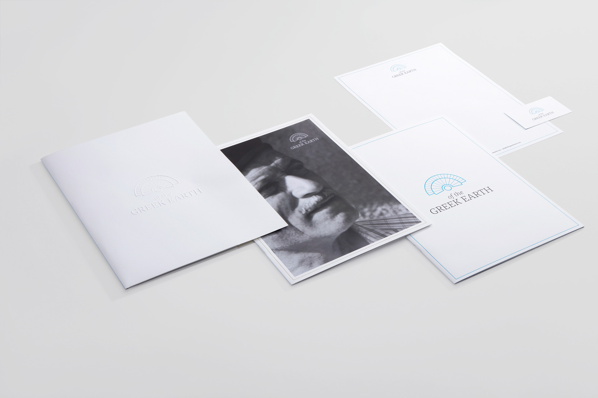
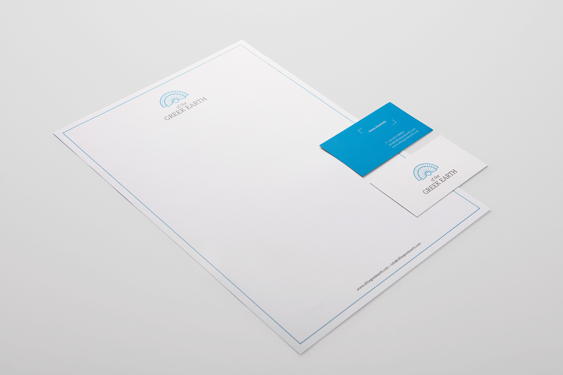
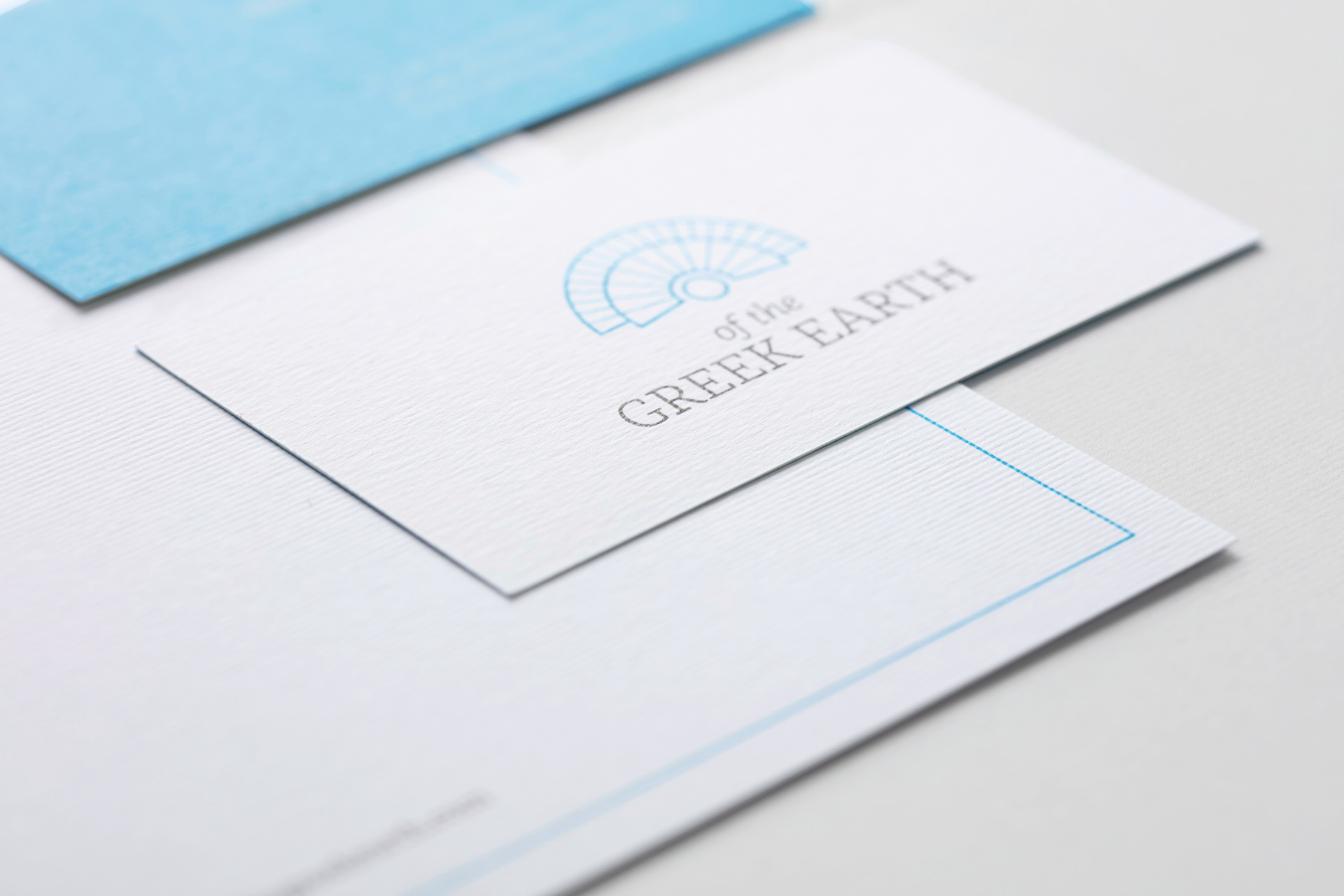
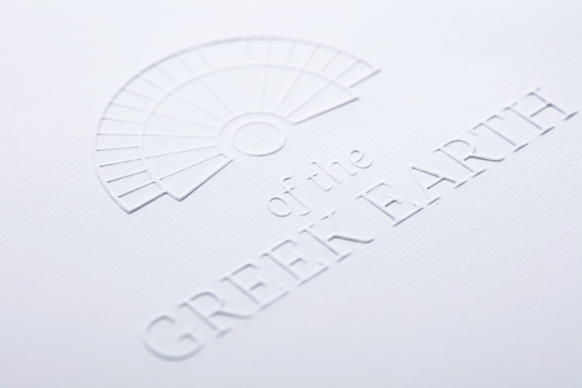
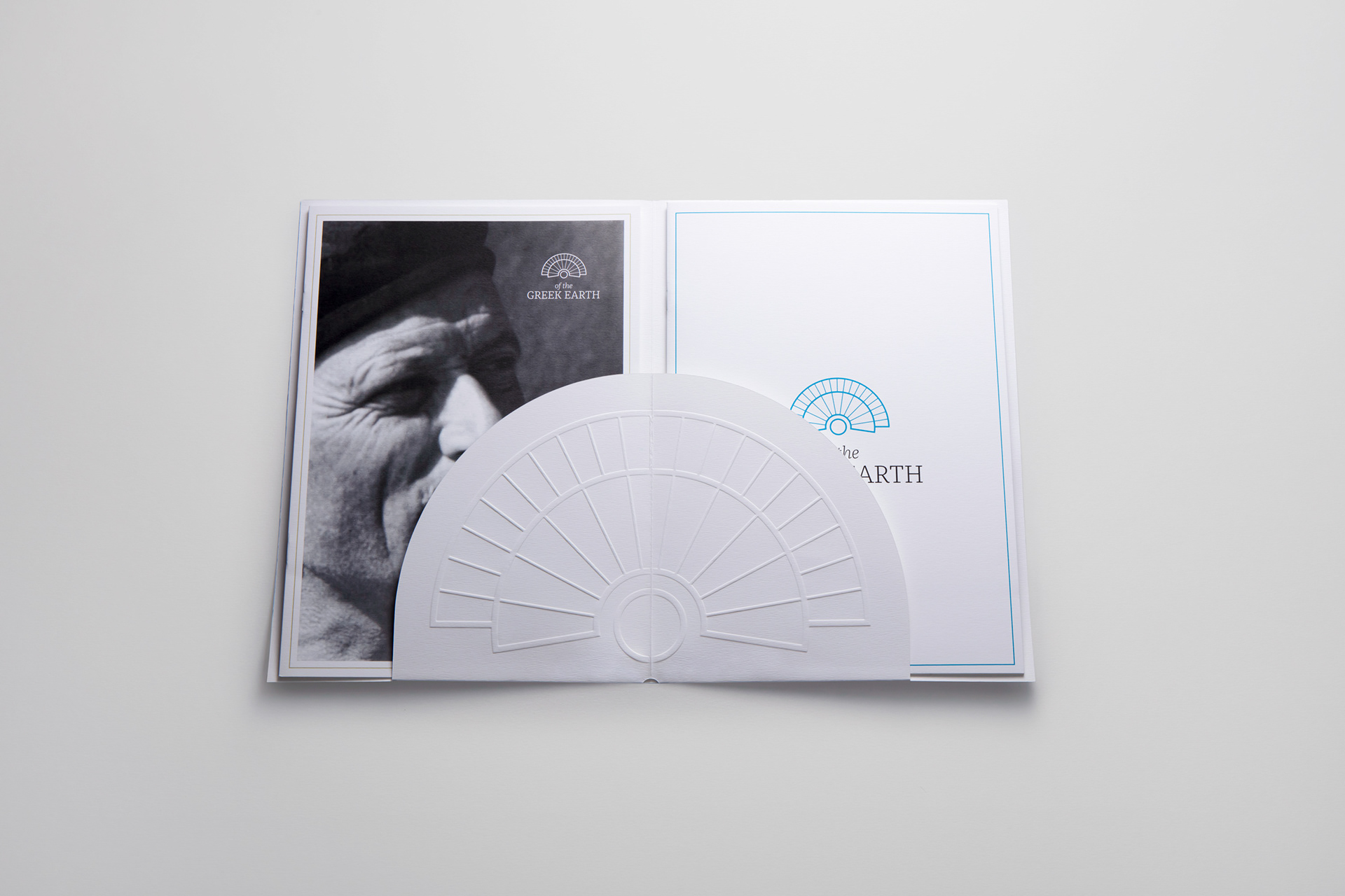
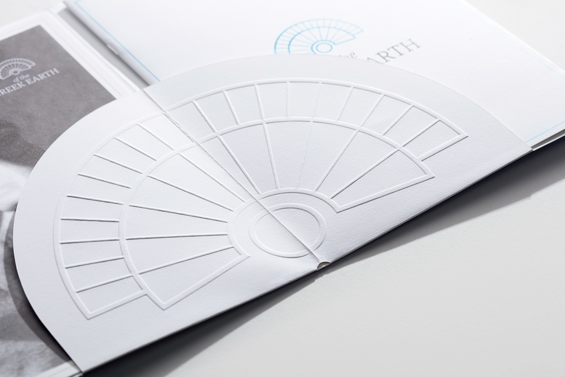
Primary and secondary marks derived from the Theatre of Epidaurus.
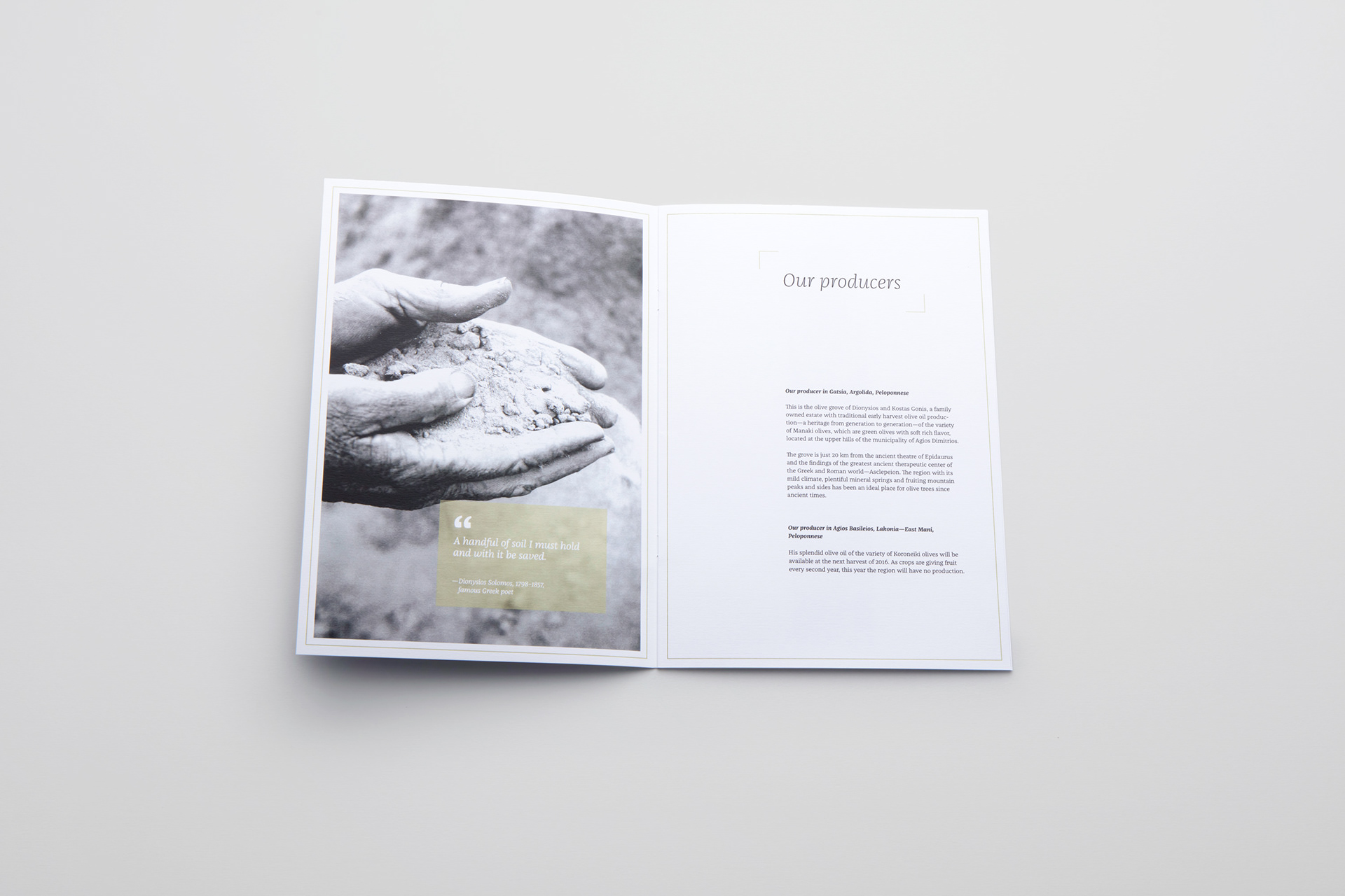
The client explicitly asked for an identity that feels unmistakably Greek at first glance, without leaning on product clichés. With Grelea olive oil as the first release from a grove near Epidaurus, the Ancient Theatre became the key reference. Its geometry was distilled into a primary mark and secondary symbol, then extended into a repeatable pattern across print and packaging.

Pattern using the mark, applied across wrapping and packaging.
The identity system extends across a variety of applications, ensuring the mark is used consistently throughout.
Grelea’s packaging is defined by typography and a repeat motif, giving it a clean and modern feel.

Photography: Math Studio